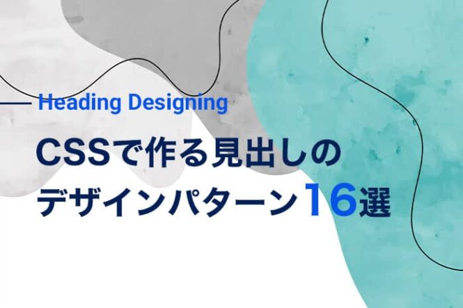
【コピペOK】CSSで作る見出しのデザインパターン16選をご紹介
投稿日:2021年11月18日
見出しのデザインで、どういったデザインにしようか悩む方は少なくないのではないでしょうか?
今回はWEBサイトの見出しによく使われているデザインのパターン16選をご紹介いたします。
また、ご紹介するデザインパターンは全てCSSで実装ができるようになっていますので、コピペして使って頂いても問題ありません。
また、以前にCSSで実装するリボン型のボックスデザインについてもご紹介していますので、気になる方は是非以下の記事を参考にしてみて下さい。
関連記事:CSSリボンボックスの作り方!基本からバリエーションまでご紹介
その他に、CSSがうまく反映されない場合は、以下の記事を参考にしてみて下さい。
関連記事:CSSが適用されない原因とは?反映されないときの対処法を解説!
それでは、さっそくご紹介していきましょう!
線及び枠の付いた見出し デザインパターン
下線の付いた見出し
【HTML】
<h2 class="heading_01">見出しのテキスト</h2>【CSS】
.heading_01{
  border-bottom: 2px solid #222;
  padding: 5px 10px;
  box-sizing: border-box;
}
【表示プレビュー】
見出しのテキスト
上線の付いた見出し
【HTML】
<h2 class="heading_02">見出しのテキスト</h2>【CSS】
.heading_02{
  border-top: 2px solid #222;
  padding: 5px 10px;
  box-sizing: border-box;
}
【表示プレビュー】
見出しのテキスト
左に線の付いた見出し
【HTML】
<h2 class="heading_03">見出しのテキスト</h2>【CSS】
.heading_03{
  border-top: 2px solid #222;
  padding: 5px 10px;
  box-sizing: border-box;
}
【表示プレビュー】
見出しのテキスト
上下に線の付いた見出し
【HTML】
<h2 class="heading_04">見出しのテキスト</h2>【CSS】
.heading_04{
  border-top: 2px solid #222;
  border-bottom: 2px solid #222;
  padding: 5px 10px;
  box-sizing: border-box;
}
【表示プレビュー】
見出しのテキスト
枠線の付いた見出し
【HTML】
<h2 class="heading_05">見出しのテキスト</h2>【CSS】
.heading_05{
  border: 2px solid #222;
  padding: 5px 10px;
  box-sizing: border-box;
}
【表示プレビュー】
見出しのテキスト
見出し線のパターンを変える場合はCSSプロパティの値を以下のように変更しましょう
【CSSの例】
/*  点線に変える場合  */
.heading_samle{
  border-top: 2px dotted #222;
}

/*  破線に変える場合  */
.heading_samle{
  border-top: 2px dashed #222;
}

/*  二重線に変える場合  */
.heading_samle{
  border-top: 4px double #222;
}
背景色及び背景画像が付いた見出しデザインパターン
単色の背景の付いた見出し
【HTML】
<h2 class="heading_06">見出しのテキスト</h2>【CSS】
.heading_06{
  background: #efefef;
  padding: 5px 10px;
  box-sizing: border-box;
}
【表示プレビュー】
見出しのテキスト
背景に画像の付いた見出し
【HTML】
<h2 class="heading_07">見出しのテキスト</h2>【CSS】
.heading_07{
  background: url("../images/heading_bg.jpg") repeat left top;  /* 画像のパスは調整して下さい */
  padding: 5px 10px;
  box-sizing: border-box;
}
【表示プレビュー】
見出しのテキスト
見出しの先頭に画像の付いた見出し
【HTML】
<h2 class="heading_08">見出しのテキスト</h2>【CSS】
.heading_08{
  position: relative;
  padding: 10px;
  box-sizing: border-box;
}

.heading_08:before{
  content: "";
  position: absolute;
  background: url("../images/heading_bg.jpg") repeat left top;  /* 画像のパスは調整して下さい */
  padding: 5px 10px;
  box-sizing: border-box;
}

.heading_08 span{
    margin-left: 40px;
  }
【表示プレビュー】
見出しのテキスト
グラデーションの背景の付いた見出し
【HTML】
<h2 class="heading_09">見出しのテキスト</h2>【CSS】
.heading_09{
  background: linear-gradient(90deg, #7abcff, #4096ee);
  padding: 5px 10px;
  box-sizing: border-box;
}
【表示プレビュー】
見出しのテキスト
背景+線が付いた見出し
【HTML】
<h2 class="heading_10">見出しのテキスト</h2>【CSS】
.heading_10{
  background: #efefef;
  border-bottom: 2px solid #333;
  padding: 5px 10px;
  box-sizing: border-box;
}
【表示プレビュー】
見出しのテキスト
背景がストライプの付いた見出し
【HTML】
<h2 class="heading_11">見出しのテキスト</h2>【CSS】
.heading_11{
  background-color: rgba(122, 188, 255, 1);
  background-image: repeating-linear-gradient(45deg, transparent, transparent 10px, rgba(166, 210, 255, 1) 10px, rgba(166, 210, 255, 1) 20px );
  padding: 5px 10px;
  box-sizing: border-box;
}
【表示プレビュー】
見出しのテキスト
背景の角を丸くした見出し
【HTML】
<h2 class="heading_12">見出しのテキスト</h2>【CSS】
.heading_12{
  border-radius: 16px;
  background: #7abcff;
  padding: 5px 10px;
  box-sizing: border-box;
}
【表示プレビュー】
見出しのテキスト
線やアイコンなどに少し応用を加えた見出し デザインパターン
英語などサブタイトル的に加えた見出し
【HTML】
<h2 class="heading_13">
  <span class="en">Heading</span>
  <span class="ja">見出しのテキスト</span>
</h2>
【CSS】
.heading_13{
  padding: 5px 10px;
  box-sizing: border-box;
  text-align: center;
  font-weight: bold;
}

.heading_13 span{
  display: block;

}

.heading_13 .en{
  font-size: 1.4rem;
  color: #3394F6;
}

.heading_13 .ja{
  font-size: 1.6rem;
}
【表示プレビュー】
HEADING 見出しのテキスト
見出しの両サイドに横線を加えた見出し
【HTML】
<h2 class="heading_14">見出しのテキスト</h2>【CSS】
.heading_14{
  position: relative;
  display: inline-block;
  padding: 55px;
  box-sizing: border-box;
}

.heading_14:before,
.heading_14:after {
  content: '';
  position: absolute;
  top: 50%;
  background: #222;
  width: 45px;
  height: 1px;
  display: inline-block;
}

.heading_14:before {
  left:0;
}

.heading_14:after {
  right: 0;
}
【表示プレビュー】
見出しのテキスト
両枠の横線を吹き出しのようにした見出し
【HTML】
<h2 class="heading_15">見出しのテキスト</h2>【CSS】
.heading_15{
  position: relative;
  display: inline-block;
  padding: 0 35px;
  box-sizing: border-box;
  font-size: 2.4rem;
  font-weight: bold;
  background: none !important;
  border-radius: 0 !important;
  color: #222 !important;
  margin-top: 10px !important;
}

.heading_15:before,
.heading_15:after {
  content: '';
  position: absolute;
  top: 50%;
  display: inline-block;
  width: 35px;
  height: 2px;
  background-color: black;
}

.heading_15:before {
  left:0;
  transform: rotate(60deg);
}

.heading_15:after {
  right: 0;
  transform: rotate(-60deg);
}
【表示プレビュー】
見出しのテキスト
両枠の横線を斜めにした見出し
【HTML】
<h2 class="heading_16">見出しのテキスト</h2>【CSS】
.heading_16{
  position: relative;
  display: inline-block;
  padding: 55px;
  box-sizing: border-box;
}

.heading_16:before,
.heading_16:after {
  content: '';
  position: absolute;
  top: 50%;
  background: #222;
  width: 45px;
  height: 1px;
  display: inline-block;
}

.heading_16:before {
  left:0;
}

.heading_16:after {
  right: 0;
}
【表示プレビュー】
見出しのテキスト
まとめ
CSSで実装できる、よく使う見出しのデザインパターン16選をご紹介いたしましが、いかがだったでしょうか?
コピペで使っても問題ありませんので、アイディアに困った際は、是非ご覧ください。
この記事を書いた人

KNOWLEDGE BASEの中の人
2013年よりWEB制作会社に入社し、デザイン・コーディングからディレクションと幅広く従事。


